Not going to include any brands in this; I wanted to play with a few different styles. But first, a little breakdown of the model itself.
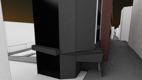
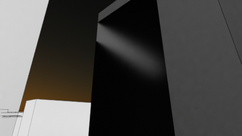
Mobile edit
Laptop died, and charging port is very finickity. That may be all for tonight…
The very next day…
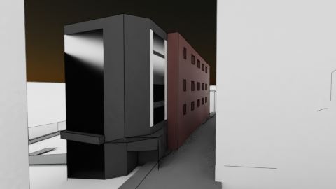
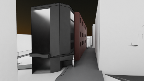
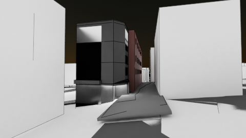
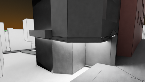
For the porchway, it does give a satisfying effect
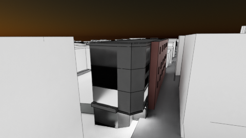
Being totally honest, I am really not keen on this model.
It’s ugly and feels like a bodge-job: the mesh is messy, and the topology around the doorway is all over the place.
I am pleased that I found a technique that works for ceiling lighting and floors though, so that’s something.
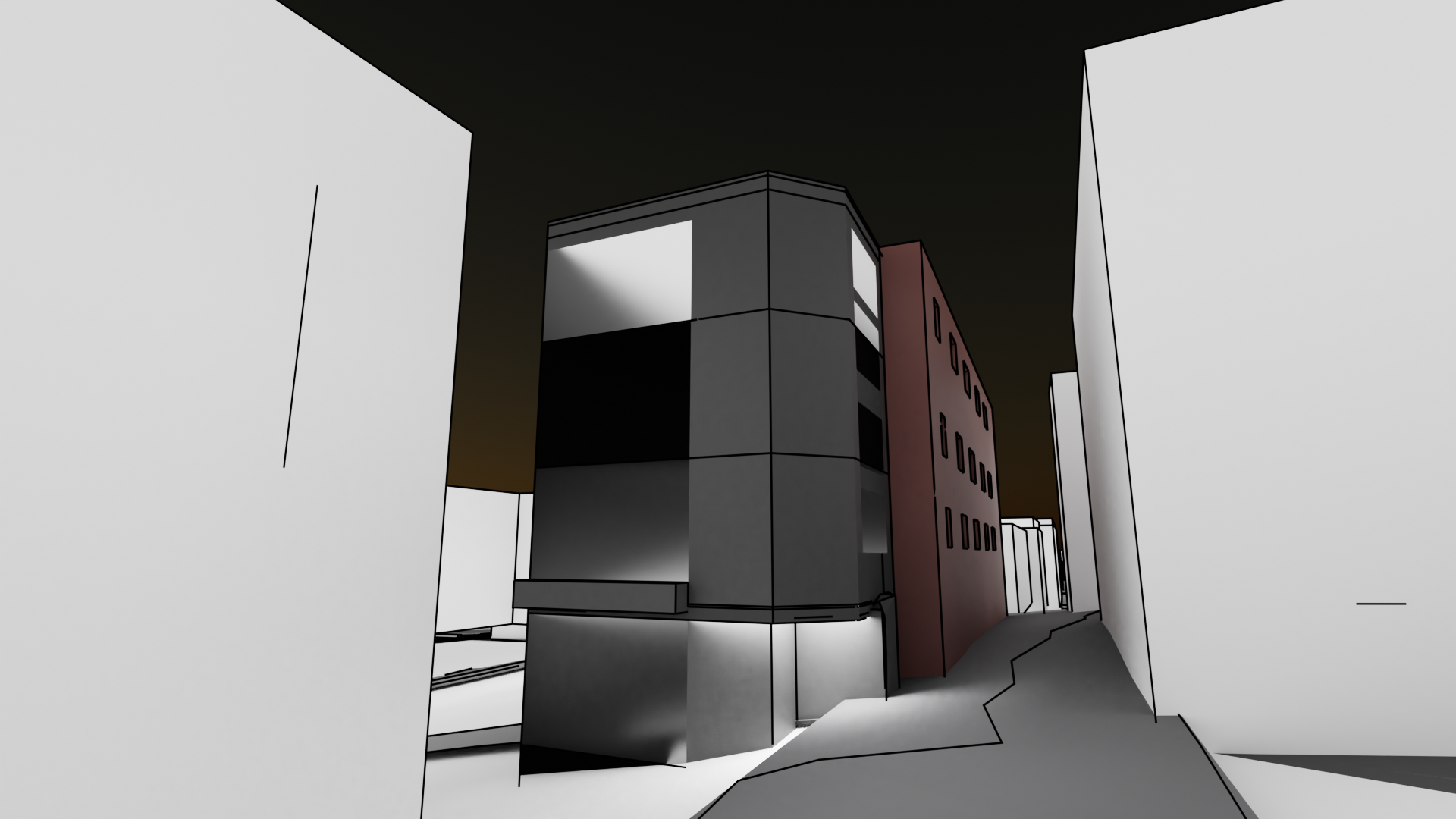
Both the top and the bottom floors have lights on their ceiling.
For comparison, no lights have been added to the middle floors, but the light seeps through from the ceiling of the ground floor onto the first floor. Again, I’m OK with this for now.
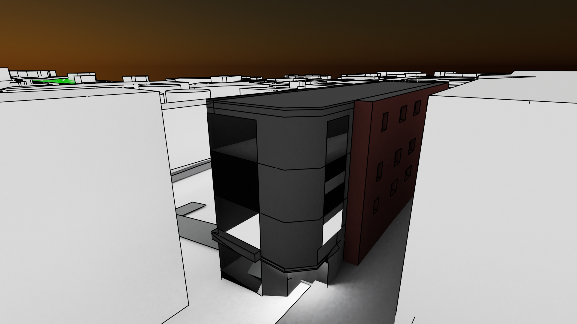
The first floor looks as if it is made entirely of light, possibly because the Toon shader doesn’t absorb, bounce and disperse light in the same way a realism-based texture would.
Why would it? Its a cartoon texture!
Well, the sky’s a nice colour at least…
I still don’t like this model, and I’m thankful that tomorrow is a new day so I can start working on another building, and thinking about how to implement a controlled demolition into the storyline.